
도찐개찐
[데이터시각화] 07. 산점도 본문
import numpy as np
import pandas as pd
import matplotlib.pyplot as plt
import matplotlib as mpl
import seaborn as sns
산점도 scatter graph
- n개의 짝으로 이루어진 자료(컬럼이 2개 이상)를
- x, y 평면에 점으로 나타낸 그래프
- 자료의 분포정도를 파악하는데 사용
- 주로 상관/회귀분석에 사용
- scatter(x축, y축, 옵션)
# 약물 투여에 따른 환자 반응
age = [23, 30, 40, 45, 60]
drugA = [16, 20,  27, 40, 60]
drugB = [15, 18, 25, 31, 40]
plt.scatter(age, drugA, color='b')
plt.show()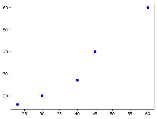
회귀계수를 이용한 예측선 그리기
- polyfit(x축, y축, 다항수차수) -> 기울기, 절편
# A약물 투여 예측 : y = ax + b
a, b = np.polyfit(age, drugA, 1).round(2)
a, b
(1.22, -15.77)# 예측선 시각화
plt.scatter(age, drugA, color='red')
x = np.arange(20, 65, 1) # range 함수와 다른건 간격조정 가능
y = a * x + b
plt.plot(x, y, 'b')[<matplotlib.lines.Line2D at 0x7f277df392b0>]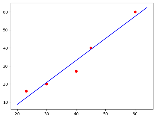
a, b = np.polyfit(age, drugB, 1).round(2)plt.scatter(age, drugB, color='red')
x = np.arange(20, 65, 1)
y = a * y + b
plt.plot(x, y, 'b')[<matplotlib.lines.Line2D at 0x7f277de52bb0>]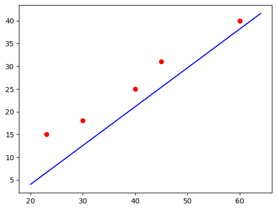
seaborn으로 산점도/회귀선 시각화
- Implot(x, y, data, ci여부)
drugs = pd.DataFrame({'age':age, 'drugA': drugA})
sns.lmplot(x='age', y='drugA', data=drugs, ci=None, line_kws={'color':'red'})
plt.show()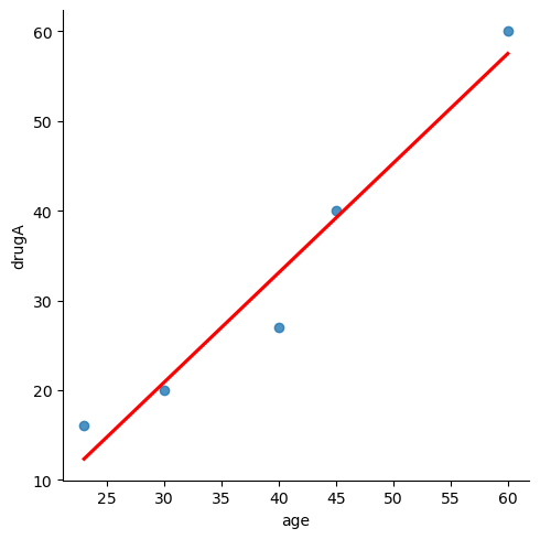
# sns.i
# sns.Implot(x = 'a', y='drugA')
신생아 월별 몸무게 추이
age = [1,3,5,2,11,9,3,9,12,3]
weight = [4.4,5.3,7.2,5.2,8.5,7.3,6.0,10.4,10.2,6.1]
plt.scatter(age, weight, color='b')
a, b = np.polyfit(age, weight, 1)
x = np.arange(0, 15, 1)
y = a * x + b
plt.plot(x, y, 'red')[<matplotlib.lines.Line2D at 0x7f277ccb9310>]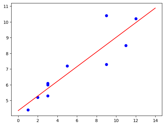
tips 총지불금액별 팁금액에 대한 관계 알아보기
tips = sns.load_dataset('tips')
tips.info()
<class 'pandas.core.frame.DataFrame'>
RangeIndex: 244 entries, 0 to 243
Data columns (total 7 columns):
# Column Non-Null Count Dtype
--- ------ -------------- -----
0 total_bill 244 non-null float64
1 tip 244 non-null float64
2 sex 244 non-null category
3 smoker 244 non-null category
4 day 244 non-null category
5 time 244 non-null category
6 size 244 non-null int64
dtypes: category(4), float64(2), int64(1)
memory usage: 7.4 KBplt.scatter(tips.total_bill, tips.tip, color='red')
a, b = np.polyfit(tips.total_bill, tips.tip, 1)
x = np.arange(0, 55, 1)
y = a * x + b
plt.plot(x, y, 'b')
plt.show()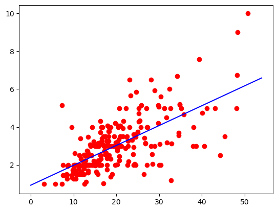
다이아몬드 캐럿당 가격에 대한 시각화
diamonds = sns.load_dataset('diamonds')
diamonds.info()
<class 'pandas.core.frame.DataFrame'>
RangeIndex: 53940 entries, 0 to 53939
Data columns (total 10 columns):
# Column Non-Null Count Dtype
--- ------ -------------- -----
0 carat 53940 non-null float64
1 cut 53940 non-null category
2 color 53940 non-null category
3 clarity 53940 non-null category
4 depth 53940 non-null float64
5 table 53940 non-null float64
6 price 53940 non-null int64
7 x 53940 non-null float64
8 y 53940 non-null float64
9 z 53940 non-null float64
dtypes: category(3), float64(6), int64(1)
memory usage: 3.0 MB# list(map(float, diamonds.price))
# df1 = df.astype({'col1':'int32'})
diamonds = diamonds.astype({'price':'float64'})#.astype({'col1':'float64'})
df = pd.DataFrame(diamonds)
df
# print(diamonds.price)
plt.scatter(x=df.carat, y=df.price, color='red')
a, b = np.polyfit(df.carat, df.price, 1)
x = np.arange(0, 5, 1)
y = a * x + b
plt.plot(x, y, 'b')
plt.show()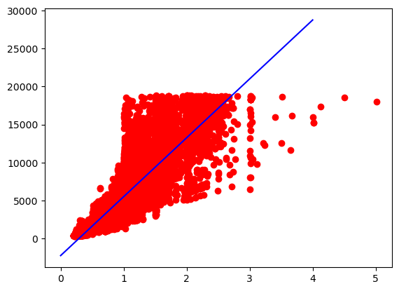
Depth 에 따ㄴ 가격 비교
sns.scatterplot(data=diamonds, x='depth', y='price')<AxesSubplot:xlabel='depth', ylabel='price'>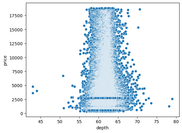
윗면 table에 따른 가격비교
sns.scatterplot(data=diamonds, x='table', y='price')<AxesSubplot:xlabel='table', ylabel='price'>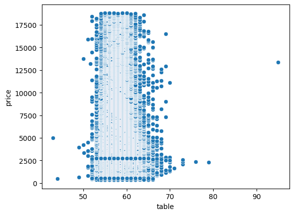
다변량 분석
- 여러 현상이나 사건에 대한 측정치를 개별적으로 분석하지 않고 한번에 동시에 분석하는 기법
- 2차원 데이터를 이용해서 먼저 시각화한 뒤 새로운 변수를 기준으로 색상을 표현함으로써 새로운 차원을 통한 분석 가능
- 범주형 데이터에 다변량 분석시에는 qualitative palette에 따른 색상을 사용하는 것이 좋음
- 정량적 데이터에 다변량 분석시에는 sequential palette에 따른 색상을 사용하는 것이 좋음
- 칼라맵 : https://matplotlib.org/stable/tutorials/colors/colormaps.html
성별 기준 총지불금액별 팁에 대한 관계 시각화
# seaborn에서는 hue라는 속성을 이용해 다변량 분석이 가능 하다
# scatterplot(data, x, y, hue)
sns.scatterplot(data=tips, x='total_bill', y='tip', hue='sex')
plt.show()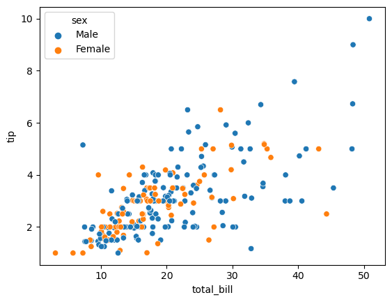
sns.scatterplot(data=tips, x='total_bill', y='tip', hue='smoker')
plt.show()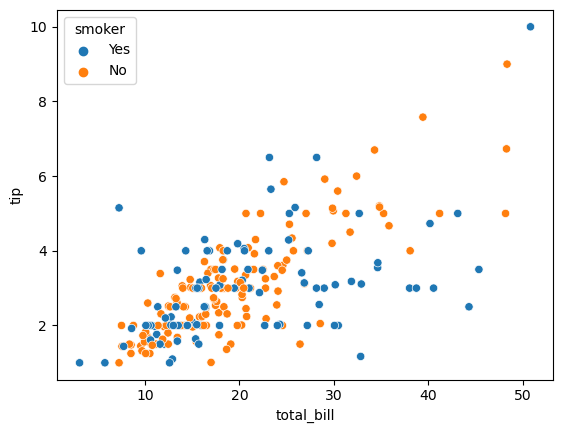
sns.scatterplot(data=tips, x='total_bill', y='tip', hue='day')
plt.show()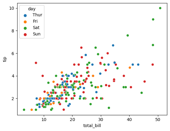
sns.scatterplot(data=tips, x='total_bill', y='tip', hue='time')
plt.show()
sns.scatterplot(data=tips, x='total_bill', y='tip', hue='size', palette='Paired')

plt.show()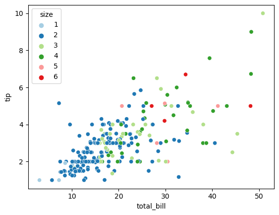
다이아몬드 캐럿당 가격에 대한 다변량 분석
diamonds.info()
sns.scatterplot(data=diamonds, x='carat', y='price', hue='cut', palette='Paired')
plt.show()
<class 'pandas.core.frame.DataFrame'>
RangeIndex: 53940 entries, 0 to 53939
Data columns (total 10 columns):
# Column Non-Null Count Dtype
--- ------ -------------- -----
0 carat 53940 non-null float64
1 cut 53940 non-null category
2 color 53940 non-null category
3 clarity 53940 non-null category
4 depth 53940 non-null float64
5 table 53940 non-null float64
6 price 53940 non-null float64
7 x 53940 non-null float64
8 y 53940 non-null float64
9 z 53940 non-null float64
dtypes: category(3), float64(7)
memory usage: 3.0 MB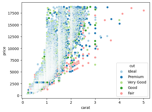
diamonds.info()
sns.scatterplot(data=diamonds, x='carat', y='price', hue='clarity', palette='Paired')
plt.show()
<class 'pandas.core.frame.DataFrame'>
RangeIndex: 53940 entries, 0 to 53939
Data columns (total 10 columns):
# Column Non-Null Count Dtype
--- ------ -------------- -----
0 carat 53940 non-null float64
1 cut 53940 non-null category
2 color 53940 non-null category
3 clarity 53940 non-null category
4 depth 53940 non-null float64
5 table 53940 non-null float64
6 price 53940 non-null float64
7 x 53940 non-null float64
8 y 53940 non-null float64
9 z 53940 non-null float64
dtypes: category(3), float64(7)
memory usage: 3.0 MB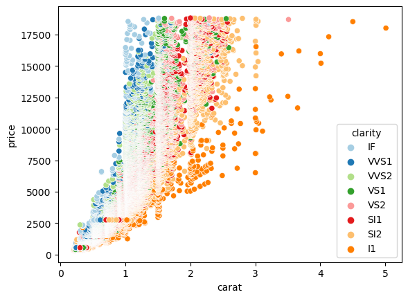
타이타닉 승객 생존에 대한 다변량 분석
titanic = sns.load_dataset('titanic')
titanic.info()
titanic.head()
<class 'pandas.core.frame.DataFrame'>
RangeIndex: 891 entries, 0 to 890
Data columns (total 15 columns):
# Column Non-Null Count Dtype
--- ------ -------------- -----
0 survived 891 non-null int64
1 pclass 891 non-null int64
2 sex 891 non-null object
3 age 714 non-null float64
4 sibsp 891 non-null int64
5 parch 891 non-null int64
6 fare 891 non-null float64
7 embarked 889 non-null object
8 class 891 non-null category
9 who 891 non-null object
10 adult_male 891 non-null bool
11 deck 203 non-null category
12 embark_town 889 non-null object
13 alive 891 non-null object
14 alone 891 non-null bool
dtypes: bool(2), category(2), float64(2), int64(4), object(5)
memory usage: 80.7+ KB| survived | pclass | sex | age | sibsp | parch | fare | embarked | class | who | adult_male | deck | embark_town | alive | alone | |
|---|---|---|---|---|---|---|---|---|---|---|---|---|---|---|---|
| 0 | 0 | 3 | male | 22.0 | 1 | 0 | 7.2500 | S | Third | man | True | NaN | Southampton | no | False |
| 1 | 1 | 1 | female | 38.0 | 1 | 0 | 71.2833 | C | First | woman | False | C | Cherbourg | yes | False |
| 2 | 1 | 3 | female | 26.0 | 0 | 0 | 7.9250 | S | Third | woman | False | NaN | Southampton | yes | True |
| 3 | 1 | 1 | female | 35.0 | 1 | 0 | 53.1000 | S | First | woman | False | C | Southampton | yes | False |
| 4 | 0 | 3 | male | 35.0 | 0 | 0 | 8.0500 | S | Third | man | True | NaN | Southampton | no | True |
sns.scatterplot(data=titanic, x='age', y='fare', hue='pclass')<AxesSubplot:xlabel='age', ylabel='fare'>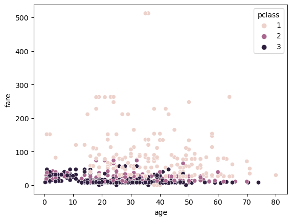
sns.scatterplot(data=titanic, x='age', y='survived', hue='sex')<AxesSubplot:xlabel='age', ylabel='survived'>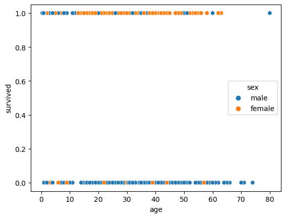
matplotlib 으로 다변량 분석 그래프 시각화
- 분석대상 컬럼은 반드시 숫자여야함
- 색상 지정시 color속성이 아닌 c속성을 이용
plt.scatter(titanic.age, titanic.survived)<matplotlib.collections.PathCollection at 0x7f277aca4160>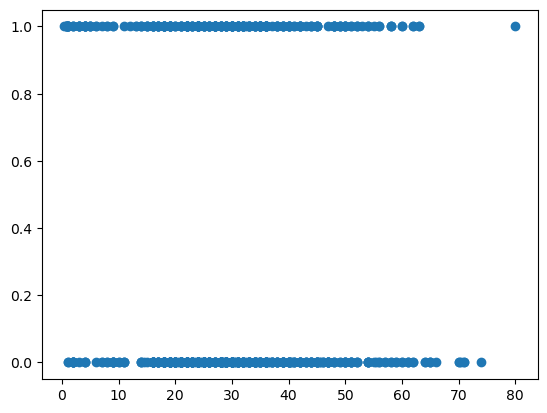
728x90
'PYTHON > 데이터분석' 카테고리의 다른 글
| [데이터시각화] 09. 교차표 (0) | 2023.01.02 |
|---|---|
| [데이터분석] 08. 박스플롯 (0) | 2023.01.02 |
| [데이터시각화] 06. 선그래프 (0) | 2023.01.02 |
| [데이터시각화] 04. 막대그래프 (0) | 2023.01.02 |
| [데이터분석] 03. 데이터 시각화 (0) | 2023.01.02 |
'PYTHON/데이터분석' Related Articles
more


Comments